Overview
Meetic, Europe’s largest online dating platform and part of Match Group, was facing growing competition from Facebook Dating and an aging product experience. User research showed that women aged 30-45 were particularly impacted by dating fatigue, struggling with superficial interactions and engagement drop-offs. Additionally, Meetic’s inconsistent UI across platforms—caused by siloed teams and a fragmented design process—was leading to a disjointed user experience.
Client
Match Group
Year
2019
Creative Lead
Johann Lucchini
UX Designer
Salma Griyech
Illustrator
Marion Deveille
Art Director
Aurélie Radom
Breaking Silos, Fixing UX: Redesigning Meetic for a Seamless Experience
Meetic’s platform was struggling with an outdated UX/UI, which lacked visual consistency across web and mobile, leading to fragmented interactions and a disjointed user experience. The siloed structure of teams—designers, product managers, and developers working in isolation—resulted in misalignment during handoffs and poor execution of design decisions. Compounding these structural issues, the platform failed to offer a personalized experience, especially for women aged 30-45, who faced dating fatigue and needed more meaningful guidance for deeper connections. To tackle these challenges, I led the strategic redesign of Meetic’s platforms by introducing a more structured, user-centered approach. I helped establish three specialized feature teams—
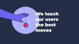
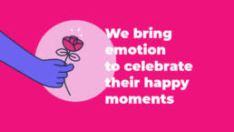
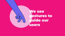
Discover, Exist, and Interact— each focused on improving key aspects of the user journey, such as personalized onboarding, profile completion, and engaging messaging features. In parallel, we revamped the visual identity with a modern UI featuring playful illustrations and universal hand gestures to improve guidance and approachability. I also spearheaded the development of Meetic’s first scalable design system, hosted on Zeroheight, which ensured consistency across platforms and streamlined collaboration. By facilitating co-design workshops, introducing design reviews, and implementing biweekly demo days, I helped bridge communication gaps and fostered alignment across teams, resulting in a more engaging and intuitive experience for users.
Slow dating. Real love stories.
Design Principles
Discover, Onboard, Guide
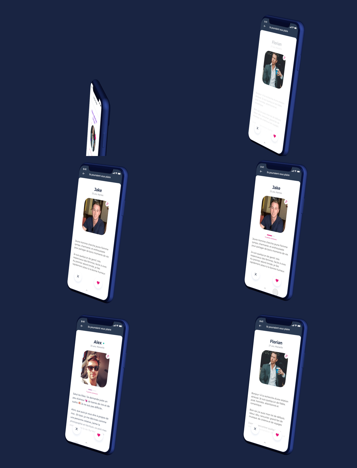
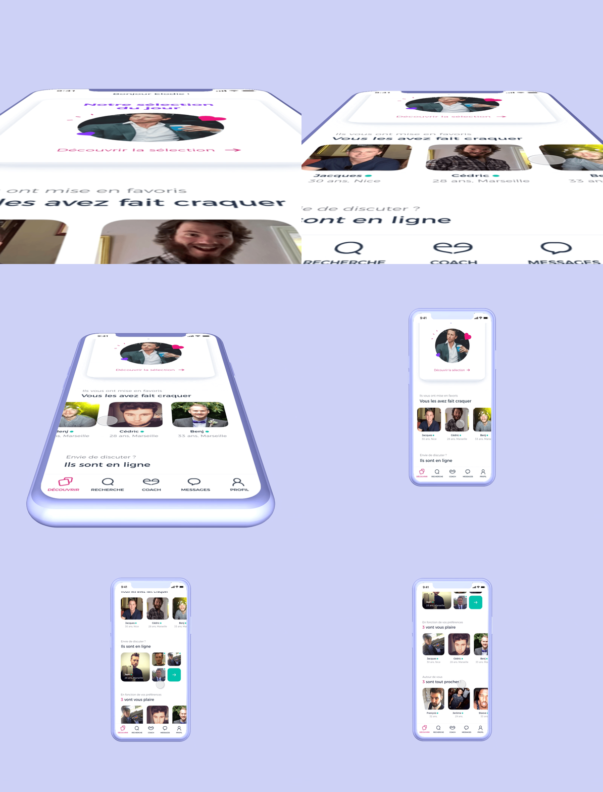
The homepage is designed for easy exploration, featuring intuitive carousels and tooltips for better navigation. Streamlined profile searches save time with a clear interface. Addressing user needs with conversation suggestions based on shared criteria builds confidence in relevance, while highlighting open profiles encourages meaningful interactions.
Interact, Advise, Engage
Enhancing user engagement requires tailored advice for different relationship stages. Features like muting, blocking, and privacy settings allow users to control their messaging experience, leading to better interactions. Personalizing the user experience and showcasing insights can foster deeper connections and authentic relationships.
Exist, Coach, Humanize
Improving profile completion involves providing clear guidance and simplifying jargon. By helping users express their unique charm, we inspire confidence in self-presentation. Humanizing the process transforms it from a mechanical task into an enjoyable experience, fostering genuine connections.
Key takeaways
Some great outcomes
This project was a turning point in Meetic’s evolution, reinforcing the power of user-centered design and cross-functional collaboration. By focusing on design consistency, meaningful engagement, and strategic UX improvements, we successfully redefined the online dating experience for millions of users.
120%
Increase in visits
+80%
of likes
+4%
