As designers, we review our design work a lot, especially in an agile context. Reviews and feedback at each stage of the creative process are both useful and crucial to the success of a product or service. The purpose is to maintain a consistent user experience, graphics, and ergonomic quality while refining our production strategy.
One of the most important times for a design review is at the end of a development sprint. This is an improved version of the classic graphic review that designers usually do alone in the overall project completion. The purpose is to carry out this exercise live with the developers so that the designers can challenge the integration and sometimes improve the design during the project. The timing of this review is essential, but the development of a standardized process is another key element to ensure that this approach can be used repeatedly and increase the development team’s interest in design quality.
But what is a 'Design Review'?
It evaluates whether or not the developed product is in line with the creative vision and the user experience communicated by the design teams. In other words, it’s a review of the developed project which helps to verify that all graphic and technical components display and function properly. This takes into consideration all devices currently on the market, using the most recent OS versions.
How did we get there?
In an agile context, even the best design work can be impacted by limited resources, technical issues, and the timing of releases. As the design gets passed on from the design teams to the product owners and development teams, each team makes changes according to various temporal or business issues, leading to significant misunderstandings. In the end, you quickly realize that the final product doesn’t correspond with the design team’s vision.
Ensure everyone's on the same page
The design review is not only the designer’s job. Working with developers early on in the project makes the design process and feedback delivery easier. Sharing the goals and constraints of each profile benefits the whole team in terms of time, resources and effort.
Identify real problems before considering solutions
During one of my reviews, iOS and Android developers told me that they couldn’t just implement a significant transition between two pages in a workflow as the design team had imagined — the user must have the choice to continue or cancel. To do this, each development team had chosen a different solution adapted to their relative constraints.
This meant that according to the different OS specifics, we ended up with a layers succession on iOS, while the Android team had chosen a workflow with modals. It turned out that the problem could be solved by creating two separate features.
By including the designers earlier to address this problem, the design could have been reworked to obtain a similar solution on both OS and avoid creating a jerky experience.
Prerequisite
Before you start a design review, it’s mandatory to have references for making comparisons. For instance, visual characteristics can be verified using UI kits or component libraries which utilize atomic design, such as DSM, Zeroheight, Sympli, and Inspect by Invision. Functional elements can be verified using specification documents, trees or user stories.
For projects created using a Design System, it’s necessary to analyze all the components while considering various types of media (digital, print, television, retail stores, etc.) to ensure coherence and quality:
· Design principles: brand values, product principles
· Branding: logo, colours, typography, images, iconography, tone of voice
· Features and user flows
Use a checklist
Here are some (non-exhaustive) elements to check to ensure the graphics and ergonomic quality of the developed project:
Alignments:
· Text Block alignments, images, buttons, logos or icons
· Margins: margins, padding, optical alignments
· Spaces: titles linked to paragraphs, numbered lists
Typography:
· Have the right fonts been used?
· Are the fonts used royalty-free?
· Are they regulated?
· There are specific rules with green numbers and Maestro or Visa credit card details.
· The typographic hierarchy: H1, H2, H3, italic, labels, etc
Colours:
· Respecting primary colours and accents
· Background colours, illustrations, text, buttons, icons, card shadows, etc
· Different interface states, with a “night” mode, for example
Affordance:
· Component states (buttons, links, icons, checkboxes, etc.) like “normal,” “hover,” “pressed,” and“disabled.”
· Micro-interactions in navigation menus or tab bars· Have the proper links been added?
· How do the different states of form fields appear? (Normal, errors, mandatory, dropdowns, focused, typing, disabled)
· Should open dropdown menus have a specific appearance?
· Do form fields have the correct size on each device?
Media:
· Check the pictures used. Are they royalty-free? If not, did you think about crediting the authors?
· Check the size of illustrations, hero banners, and icons in the case of a responsive display (breakpoints between desktop, tablet, and mobile)
· Observe scrolling images of carousels
· Check video playback (pictures and sound) for any bugs when displaying JSON files created with the Lottie plugin
· Check micro-interactions and transitions between pages
Languages:
· If it is a multilingual project, check the display and structure of your paragraphs and the wordings when changing the language.
· Switching from one language to another may impact the display and sizes of components. For instance, a call-to-action “Go” in English will have a longer translation in French, like “Je me lance.”
Browsers
When it’s a website, it’s better to test it across several browsers (Chrome, Safari, Firefox, Opera, and Internet Explorer) to detect any display differences because of their different CSS interpretations.
Many tools to help you
To follow up, assign tasks and comments:
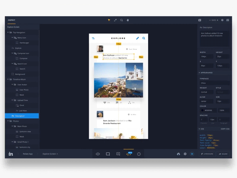
To inspect and generate style guides:
· Zeplin
· Inspect by inVision
· Sympli
To analyze your websites:
· CSS Peeper
· Visual Inspector
· Pastel
· Perfect Pixel
To review iOS apps:
For iOS and Android developers:
· Android Studio
· Xcode
How to perform a good design review?
Before you start, check the OS version or the browser according to your target users’ habits. Check out the build or release version in production when it's an application.
During the design review, note all of the developers’ feedback to be able to follow up on the various graphical and functional bugs detected.
One of the best solutions in an agile context is to have a backlog on Trello with different cards describing the features by platform (iOS / Android app, web). You can create checklists within each card and add screenshots of the developed project vs. your design to have a clear idea of the differences which the developers need to correct.
Finally, communicate your live feedback to the developers in a transparent way. They’ll be able to tell you their issues and allow you to adjust the design while keeping a harmonious experience for your users.
This article was first published on UX Planet
https://link.medium.com/a05gLWm14U