Overview
A playful and intuitive experience
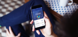
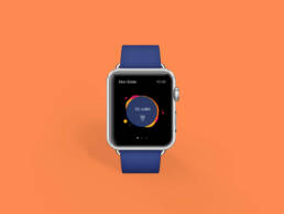
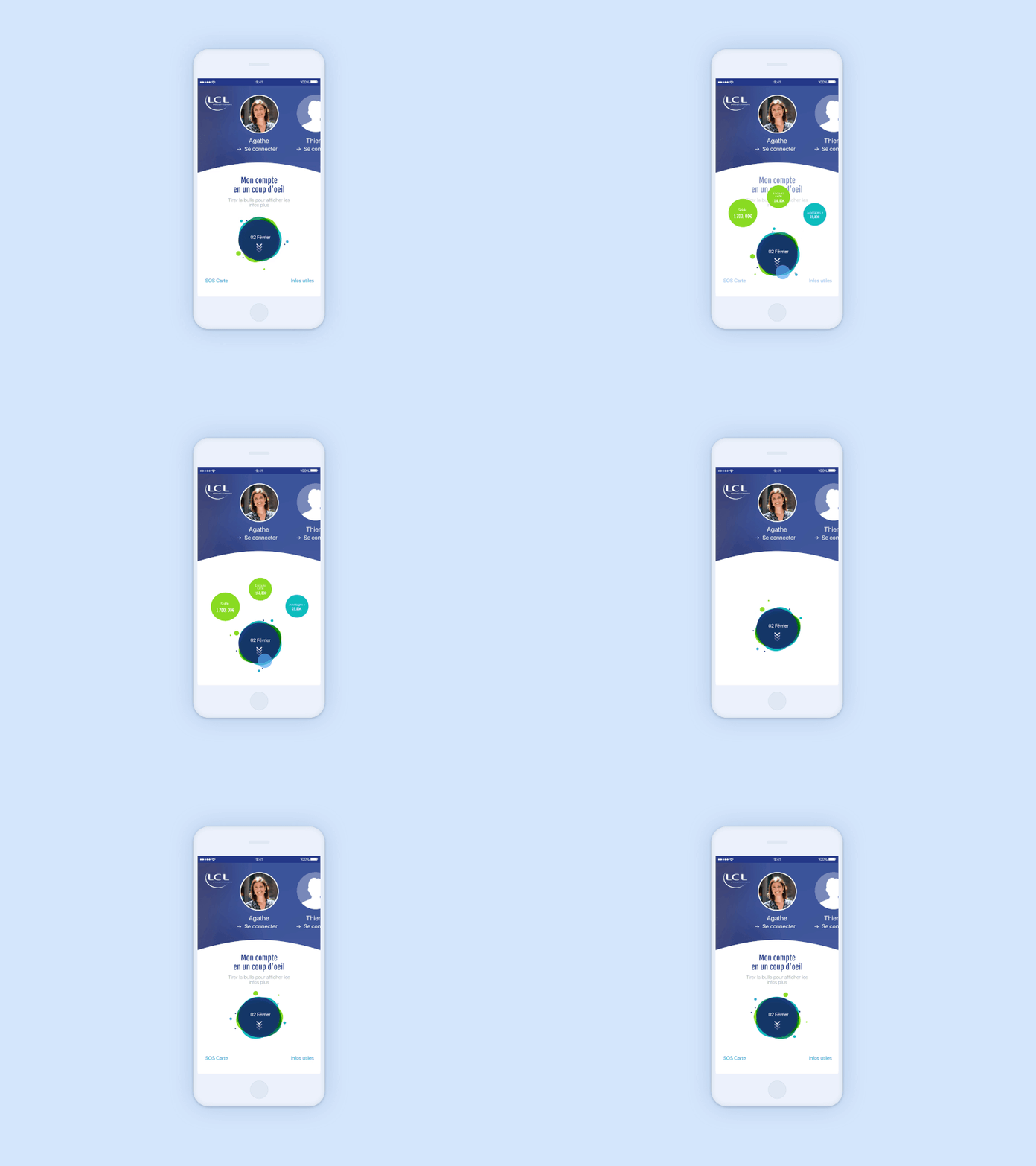
In 2017, LCL, one of France’s largest banks, faced a critical need to modernize its mobile banking app, which had been stagnant since 2014. User feedback highlighted frustrations with the outdated, complex interface. As Lead Designer, I spearheaded a design sprint to simplify core banking tasks, focusing on usability and accessibility. We introduced features like the aggregation of external accounts, centralizing all bank balances into one easy-to-navigate feed. This streamlined design, recognized by users as Best French Bank App by meilleurebanque.com for 3 consecutive years, (2018, 2019, 2020) provided an intuitive and engaging experience.
The Challenge
Rethink the mobile banking experience
The app was confusing, with disjointed sections for accounts, cards, loans, etc. User feedback indicated that it lacked simplicity and was no longer user-friendly. We also had a limited budget but an open-minded client willing to collaborate.
Design Principles
Guiding principles behind the user-centered experience
Simplicity first
The app is designed for daily utility, prioritizing efficiency. We eliminate unnecessary steps and clutter, making core interactions quick and intuitive.
Content prioritization
Focused on helping users navigate easily, we prioritize key tasks and features, customizing content and layouts to streamline the experience.
Bringing design to life
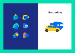
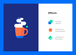
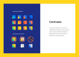
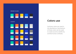
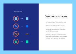
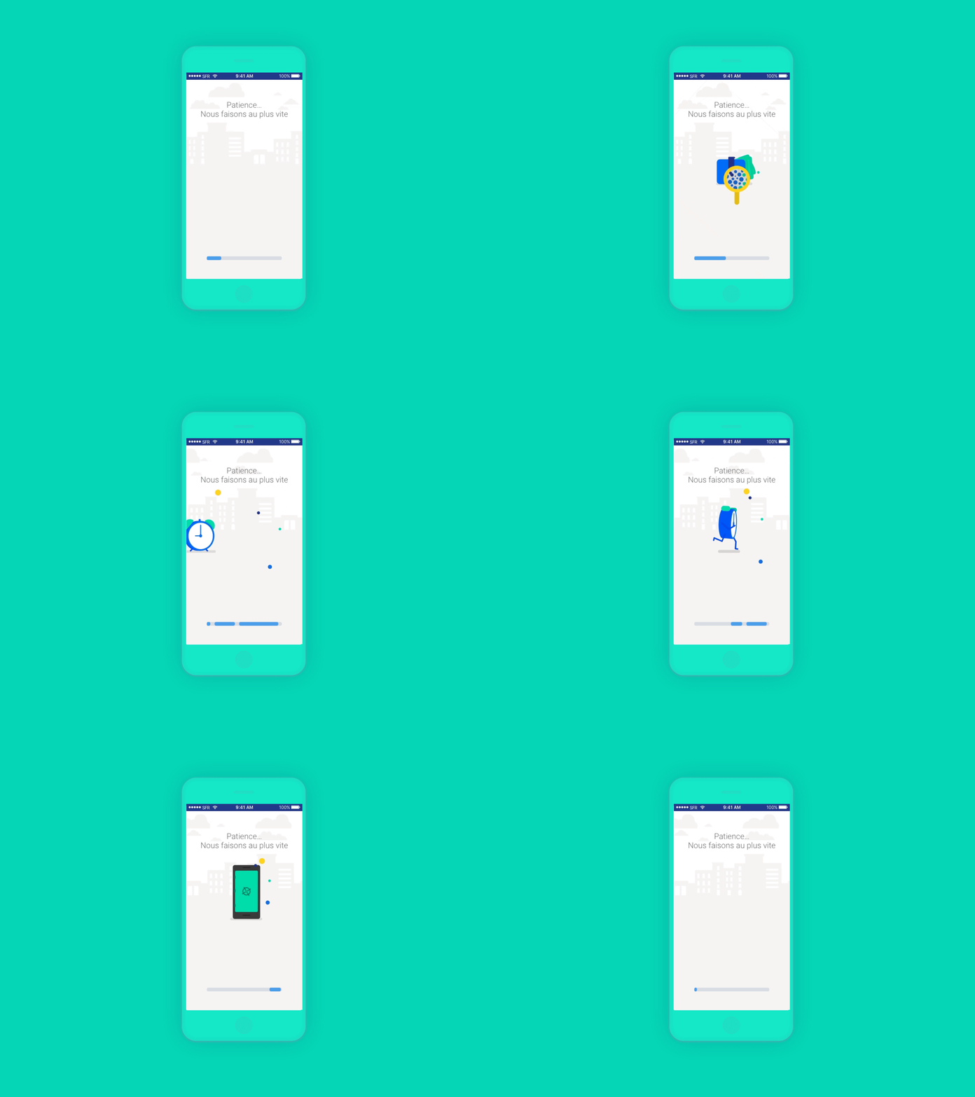
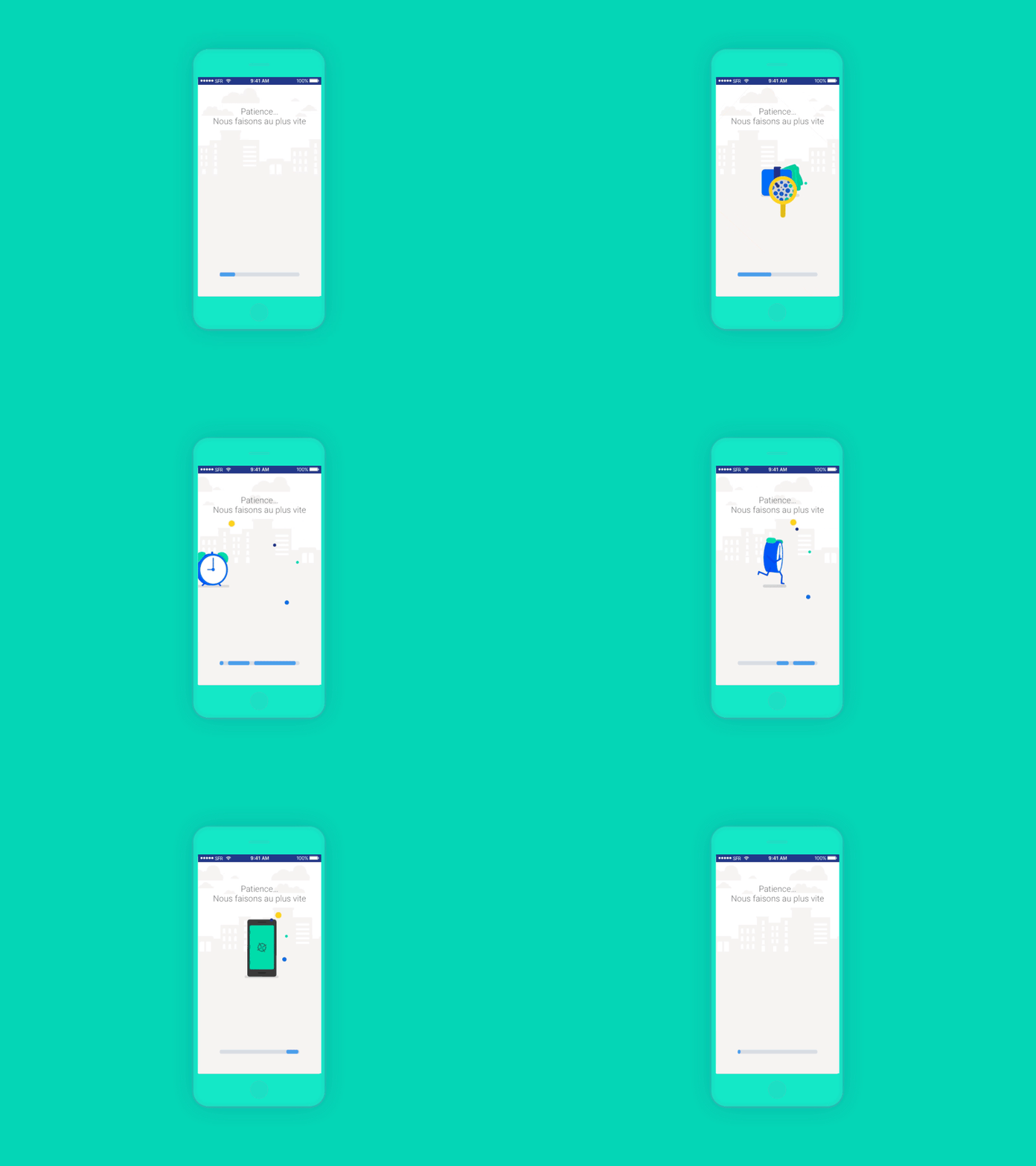
Visual elements—illustrations and animations—enhance usability, aligning with user needs and expectations, making interactions engaging while supporting overall design goals.
Design Process
Simplify everyday banking
To design a personalized experience that meets the user’s individual needs, we did user research and interviews with many LCL clients to know their unique perspectives and needs. This way, we defined three principle customer profiles: the insecure, the self-manager, and the investor. Our personas were born through their needs and pain points, empathy maps, and content mapping. After analyzing the bank market between traditional banks and fintech, we did focus groups, prototypes, and guerilla testing to define a new positioning in the French market.
Outcomes & Results
A pleasant, dynamic and unique user experience
The redesign resulted in over 1 million downloads across iOS and Android, with a 3.7-star average rating on both platforms and 350,000 daily active users. The app was recognized as the best French bank app in 2018, 2019, and 2020 by meilleurebanque.com This success showcases how our design approach transformed the banking experience into a more accessible, user-friendly, and enjoyable platform.
Shoutout to the team:
-
Lead UX Designer: Valérie Koplewicz
-
Design Strategist: Valentina Pedrazzini
-
Product Manager: Victor Megnin
-
Project Director: Elodie Randon
-
Lead UI & Interactive Designer: Aurélie Radom

